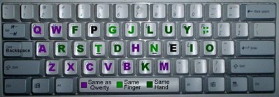
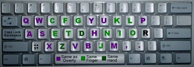
 I could get a small improvement by moving L and Y in order to get Y in a more comfortable spot, and to remove the same-finger contention for the common digraphs LO, OL and MY. In order not to cause new problems, I'd have to shuffle Y, L, U, J, P, and K. However, this would make only 11 letters match Qwerty, which in turn means it is less different from Colemak, which keeps 10 letters. Actually, I'm kind-of considering switching P and U, which would make 13 letters match Qwerty, but my digraph data indicates that same-finger typing would increase by 0.52%. On second thought, the tradeoff is insufficiently compelling; I'll leave things how they are.
In the choice between Asset and Colemak, I guess what it comes down to is how much Qwerty similarity is desired. Asset keeps 12 letters while Colemak keeps 10; and in total, my Nov. 13 redesign also keeps 20/26 letters on the same finger, whereas Colemak only keeps 15/26. Unfortunately, how important it is to keep keys on the same finger is purely a matter of opinion, because it would probably take a quite expensive study to tell for sure.
Now, Colemak and Asset have many similarities, the only major differences I can see being that (1) Asset is more similar to Qwerty, (2) Asset's Y key could be better placed, and (3) Asset has higher same-finger typing.
Colemak's designer, Shai Colemak says that "Asset has 100% more same-finger ratio compared Colemak." That could be true (evidence?), but I tried a corpus of several books at http://colemak.com/Compare and found that Colemak usually has under 2% same-finger typing, which implies under 4% for Asset. Now, if we assume digraphs typed with the same finger take twice as long to type as digraphs on different fingers (actually I think it's less than twice), then we would conclude that a Colemak typist could potentially type about 2% faster than an Asset typist.
So that's the trade-off. More similarity to Qwerty or 2% more speed. I guess we'll let the community decide. Mind you, Colemak has more followers so the conclusion is probably foregone. Anyway, I guess I should resubmit the new Asset…
It would be kind of nice if Shai and I could come to a compromise. For example, on Colemak's home row you see ARST:
If he switched R and S then S would be back in its Qwerty position, and the Ctrl+S (Save) shortcut would be preserved. My digraph data indicates that if R and S were switched, the amount of same-finger typing would increase by 0.22% (e.g. 1.92% instead of 1.70%), so one might expect typists that are 0.2% slower—no big deal, IMO. I guess he wouldn't think it worthwhile, since he has declared the layout "stable", but as I said on the forum… if he switches them, I'll drop out of the competition and replace my Asset page with a page that praises Colemak :)


